RAP - Icons
How do you find the right icons in the UI5 environment, and how can you integrate them into your Fiori Elements application using ABAP? Let's answer this question in this article.

Table of contents
In this article, we'll look at how we can improve the UI using standard icons and how you can place them in different locations.
Introduction
So far, our Sales App still looks relatively ordinary and somewhat "colorless". We now want to add icons in various places to simplify the recognition of data records. We will define an icon based on the deviations in the sales process. Is there a fixed deviation, a percentage deviation, no entry, or both?
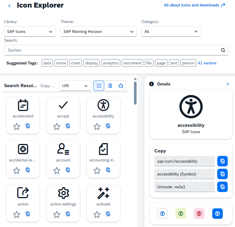
Icon Explorer
In one of our first articles, we looked at the topic of Icons in the SAP GUI environment. Previously, this was the pinnacle of creativity, searching for the perfect icon for your button. However, for consistent UIs, standardized icons should be used whenever possible, allowing for easy use without extensive training. For example, a trash can icon is always used to delete something. In the Fiori world, icons are still important for representing items in lists, making them easier and faster to see. SAP provides the Icon Explorer for this purpose, where you can easily search for the available icons you want to use in your application.
You can usually recognize a Fiori icon by the addition of "sap-icon" followed by the actual icon as text. The UI also provides a preview and further information about the selected entry.
sap-icon://accessibility
Information
In the next step, we need to make the actual information about the icon available to the UI. For this, we need a field for the UI that contains the final icon of the data record. The type is not so important; it only needs to hold the text for identification.
Development
Currently, there are two ways to deploy this. We can create the field directly in the Core Data Service, as a virtual element, so to speak, via a CASE statement. This is only possible at the root/interface level and not in the projection. Since we don't need the field in the draft or on the database, but only for the UI, a solution using a virtual field is a good option.
Virtual Field
We have already defined virtual elements in other articles in this series to provide additional information to the UI. Therefore, we are extending the projection view ZBS_C_SASale with the new field and the annotation.
        @ObjectModel.virtualElementCalculatedBy: 'ABAP:ZCL_BS_DEMO_RAP_SALES_VE'
virtual LineIcon          : abap.char(50),
Then we need to enrich the field in the class ZCL_BS_DEMO_RAP_SALES_VE. To do this, we extend the CALCULATE method, since we already request all the necessary information in GET_CALCULATION_INFO. Here, we use a COND statement to compare the different use cases and return the corresponding icon.
original->LineIcon = COND #( WHEN original->DifferenceAmount > 0 AND original->DifferenceQuantity > 0 THEN
                               'sap-icon://alert'
                             WHEN original->DifferenceAmount > 0 THEN
                               'sap-icon://money-bills'
                             WHEN original->DifferenceQuantity > 0 THEN
                               'sap-icon://commission-check'
                             ELSE
                               'sap-icon://sys-help' ).
Service
If we now call up the service and display the field, there is currently no change. The column is populated with the correct text from the query. At least we now have the appropriate information in the UI and will create icons from it in the next section.
Including Icons
Now let's create corresponding icons from the texts and include them in different places.
Semantics
Before we include the icons, we should set the corresponding annotation in the Projection View. With "Semantics.imageUrl" we define the content of our virtual field as an image with a URL. This means the field is interpreted differently for the UI.
@Semantics.imageUrl: true
List Report
Since we have converted the field into an icon, we only need to display it in the standard settings and assign it a corresponding label. To do this, we extend the metadata extension ZBS_C_SASale, add the field as a "LineItem", and place it at the beginning.
@UI.lineItem: [ { position: 1, label: 'Icon'  } ]
LineIcon;
We can then see the result directly on the homepage in the List Report.
Depending on the defined column, however, a lot of space can now appear in the UI, which cuts off important information. We can manually set the column width using the UI annotation "cssDefault.width".
@UI.lineItem: [ { position: 1, label: 'Icon', cssDefault.width: '7em'  } ]
LineIcon;
The UI looks better after the adjustment, and most of the whitespace has disappeared. You should check how the units and width behave in the different UI resolutions (desktop, mobile). We used "em" (font size) in this example, but you can also use "px" (pixels).
Object Page
On the Object Page, we usually have the option to display the icon in the header or in a list of another entity, which is similar to the List Report. The implementation is quite simple, as we only need a header annotation. For this, we extend the metadata extension ZBS_C_SASale.
@UI.headerInfo.imageUrl: 'LineIcon'
We specify our defined field as the imageURL and can then reload the app. The icon will be displayed next to the key and description in the header. If you also use information in the header (purpose: #HEADER), the icon will be displayed even larger.
Example
If you would like a practical insight into modeling with icons, we can recommend a YouTube video from the Recycling Heroes series, where we go through the topic of virtual elements and additional UI features in a practical example.
Complete Example
You can find the complete example in GitHub in the corresponding package for the Sales App. The changes from this article can be found in this Commit and you can follow the changes, plus the additional information.
Conclusion
The world becomes a little more "colorful" and vibrant again with icons. In Fiori and Fiori Elements, there are a few more rules about where you can and shouldn't use icons. Therefore, familiarize yourself with the design guidelines in the Fiori environment.
Source:
SAP - Icon Explorer